Crown Castle
Redefining Tower Equipment Reconciliation with Drone Scans and interactive Data Matching.

Details:
Category:React Web Application
Employer:Crown Castle
Crown Castle owns, operates and leases more than 40,000 cell towers across every primary U.S. market. Each of these towers has numerous equipment parts that must be maintained and updated in their systems. This was a React application intended for internal users of Crown Castle. An application to help a current job process that was taking way too long and requiring users to swivel chair between many different systems.
Project Start and Duration
The initial UXR discovery for this project started in early 2023 and has recently launched into MVP as of June 2024. Ongoing user testing is happening today, with consistent enhancements to functionality that are currently in progress.
My Role and Responsibilities
This project was one of the first React applications built in-house through the newly established Product Design department. My role was officially part of the Product Management group. Still, I also integrated with the engineering teams in a support role.
I was assigned throughout the project lifecycle to discover, design and help develop the solution. My responsibilities included planning and requirements gathering, user interviews, mock-ups, prototypes and agile development support. I collaborated with multiple engineering and development teams to brainstorm problems and turn them into solutions.
Project Summary
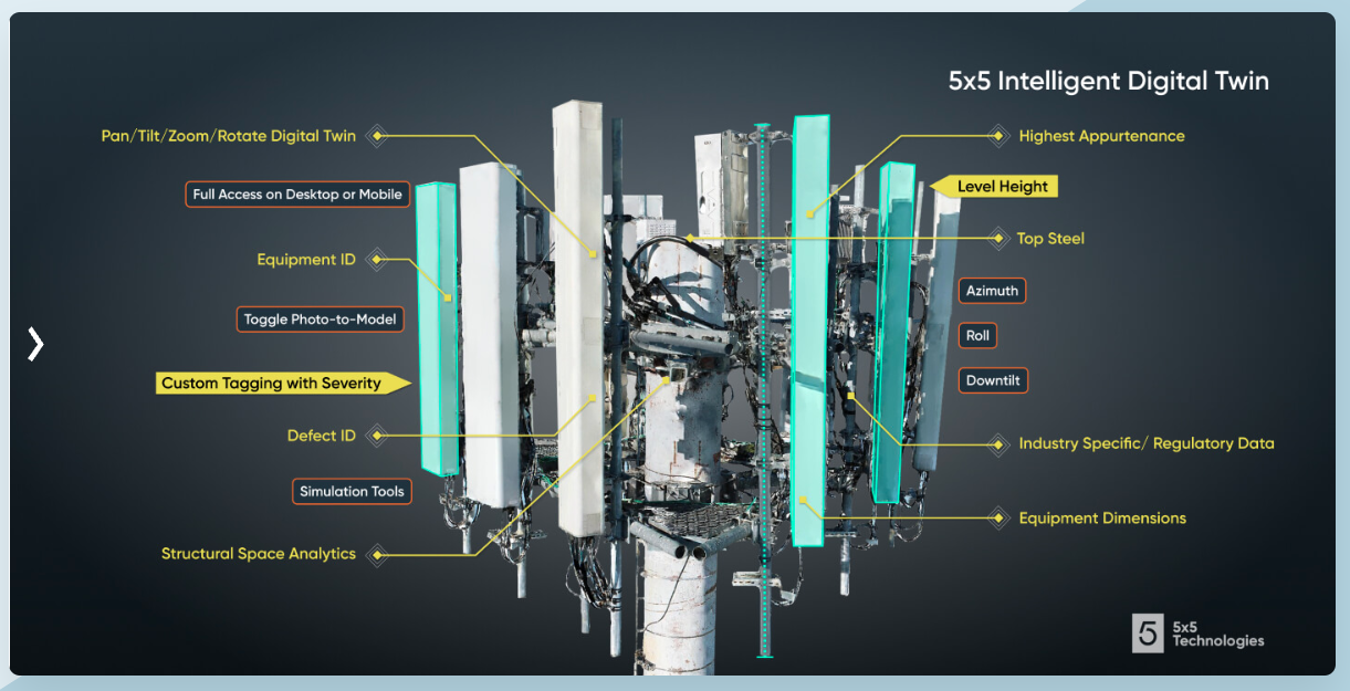
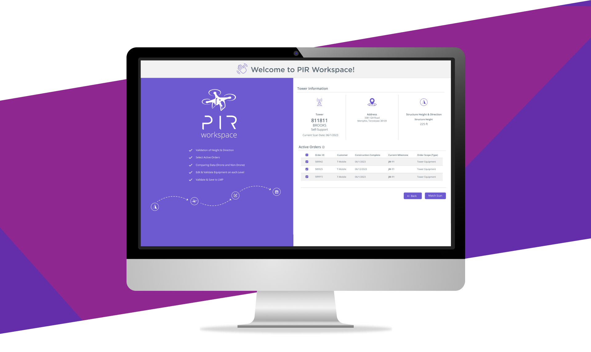
Drones fly to a site (Tower) and capture images, 3D modeling, directions, and height, producing a highly accurate view of the equipment on that tower. This view allows Crown Castle to compare those data read-outs to the (Very out of date) existing data. Users would then have to open multiple applications and manually update each tower in a data table. Crown Castle needed a faster way for users to reconcile tower information with the newly accurate data. A single interface where users can see both the old and the new data and then enable them to match up and reconcile each tower.
The Problem to Overcome
During the UXR interview process, we discovered that the current workflow had many steps, bringing users through several systems. Every user worked through 17 repeated steps that took 2.5 hours to process just one drone reconciliation—this swivel chair process of working and disconnected information needed to be brought into a single location. In addition, the laptops the users were working on would slow as applications were opened. We had to cut that time down and simplify this process.

The Solution
The main goal was to reduce the amount of “Swivel Chair” work and the overall time it takes to complete a tower inspection. Our solution was to create an all-in-one system that allowed users to view all equipment attributes easily and update the old data in a straightforward movement. A workflow that would combine the 17 steps into just a few.
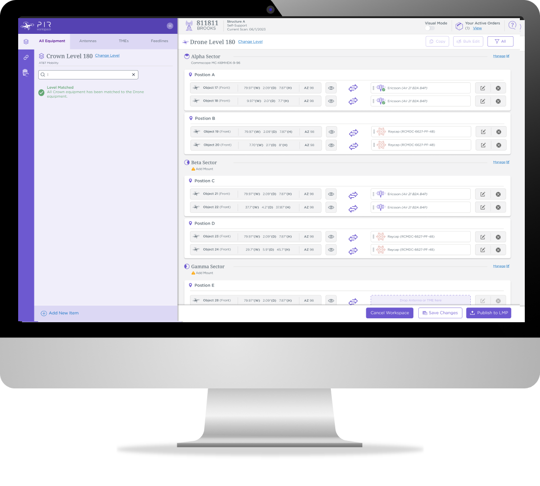
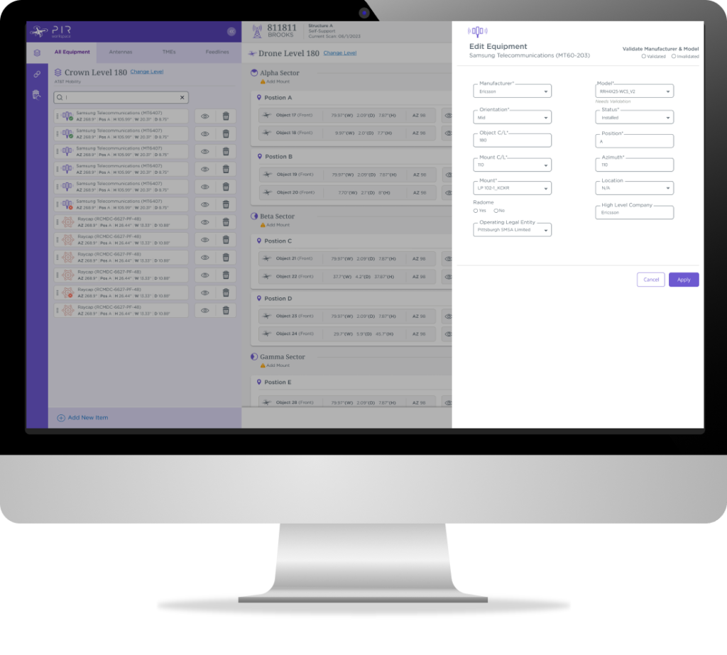
The first workflow was a “Tabular Matching” style. This workflow allowed users to drag and drop the existing pieces of equipment. Each piece of equipment was represented as draggable cards. When the user matches the equipment card, the existing equipment will inherit the accurate drone information. Manual updates to all the data points would no longer need to be how things were done..
A Secondary Solution
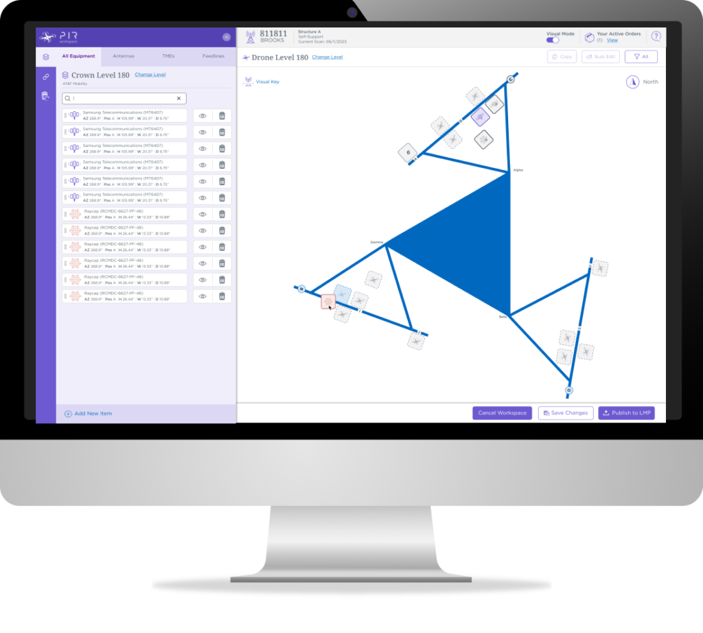
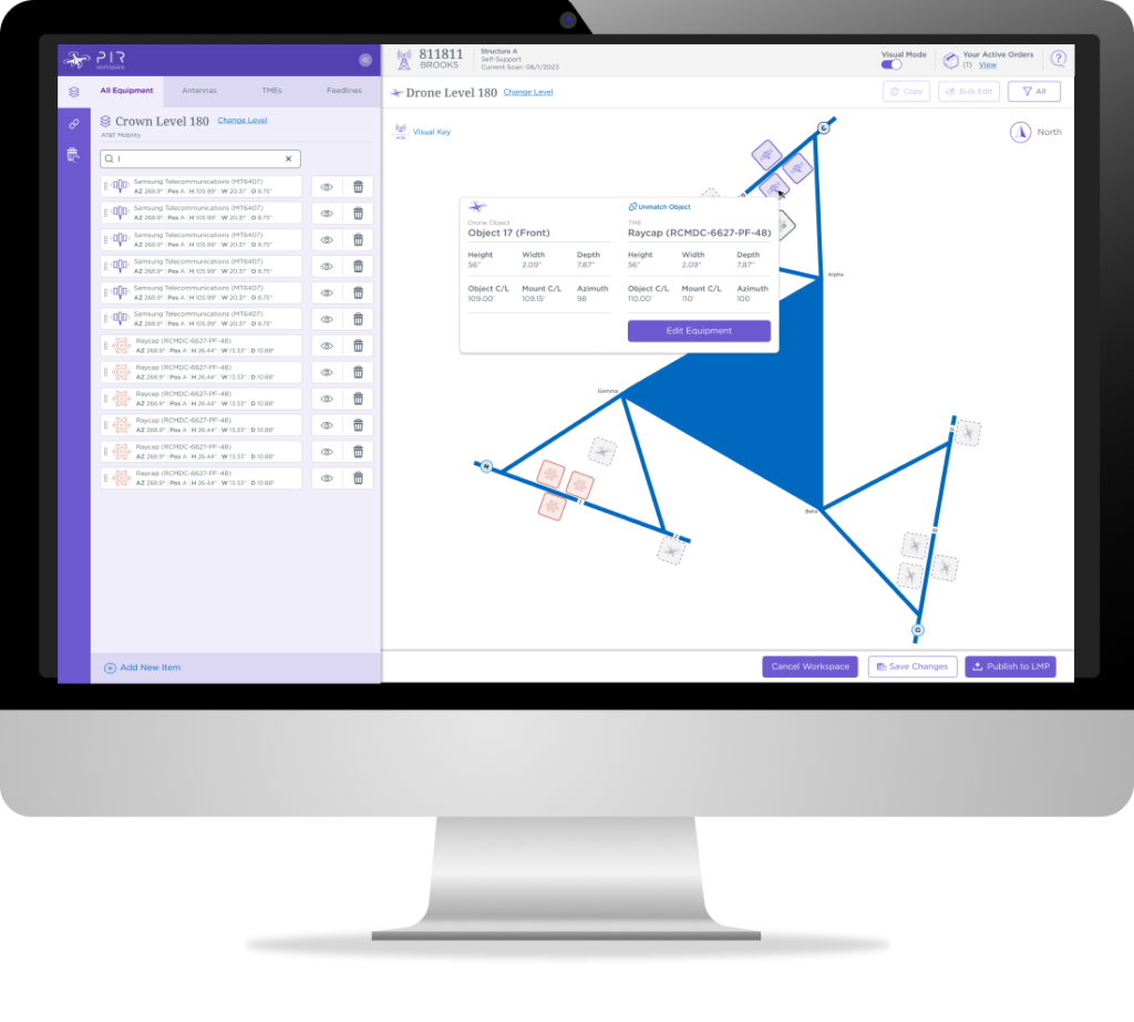
The alternative workflow was a “Visual Matching” style. It had the same process but gave a graphical representation of the tower instead of a list. This interface gives users an actual reference to compare the 3D scans they were working on. Once all the equipment items were matched, the user could publish the clean data back to the system of record.
Unknown Challenges Overcome
During our user testing, it became clear that accessibility was a big issue. Some users had wrist and hand issues, and it was painful to drag and drop for so long. The solution was to come up with a click-to-click process. This solution allowed two different ways of matching depending on your preferred style.
The project is in MVP and going through continual user testing to improve the workflow.

- Prev
- Prev
- Next
